Thursday 10 March 2011

Final Piece - Poster

I have decided to go with the blue flower idea...I created as many flowers as I had blue paper and had to duplicate a few on photoshop to get to the 100 mark.


Above you can see my final piece. (Development in sketchbook). I think the colour scheme I have used compliments each other and the white text looks modern against the blue flower background.

Experimenting...Take Three

Here I have experimented with a technique I used early on in this project...


I really like the shadows that the piece creates when lighting is put next to it.

Experimenting...Take Two

Here I have created a paper piece, purely presenting the text. I have tried it out using '100 Years'.
I really like the technique and it looks really effective, however, I would prefer to use the previous idea.

Monday 7 March 2011

Experimenting

Time to play around a little bit...


I have started by creating a simple shape out of bright blue paper. I have created this by simply cutting slots from the centre of the circle. 


I really like this modern look that the 3 flower shapes together create.

Here I have created a possible typeface to go with the flowers. I have used a gold paper to create the 100. The colours of the 100 and the flowers really compliment each other. 

Wednesday 2 March 2011

GFSmith Paper

Task Two Begins :)

I have started the second part of the brief by looking into the company website, and trying to get a feel for how they promote their products and their style of design...


Final Sculpture Images

I have finally finished my tentacle inspired final piece. All that is left to do is photograph it properly, with decent lighting, but until then these are my attempts and photographing it...


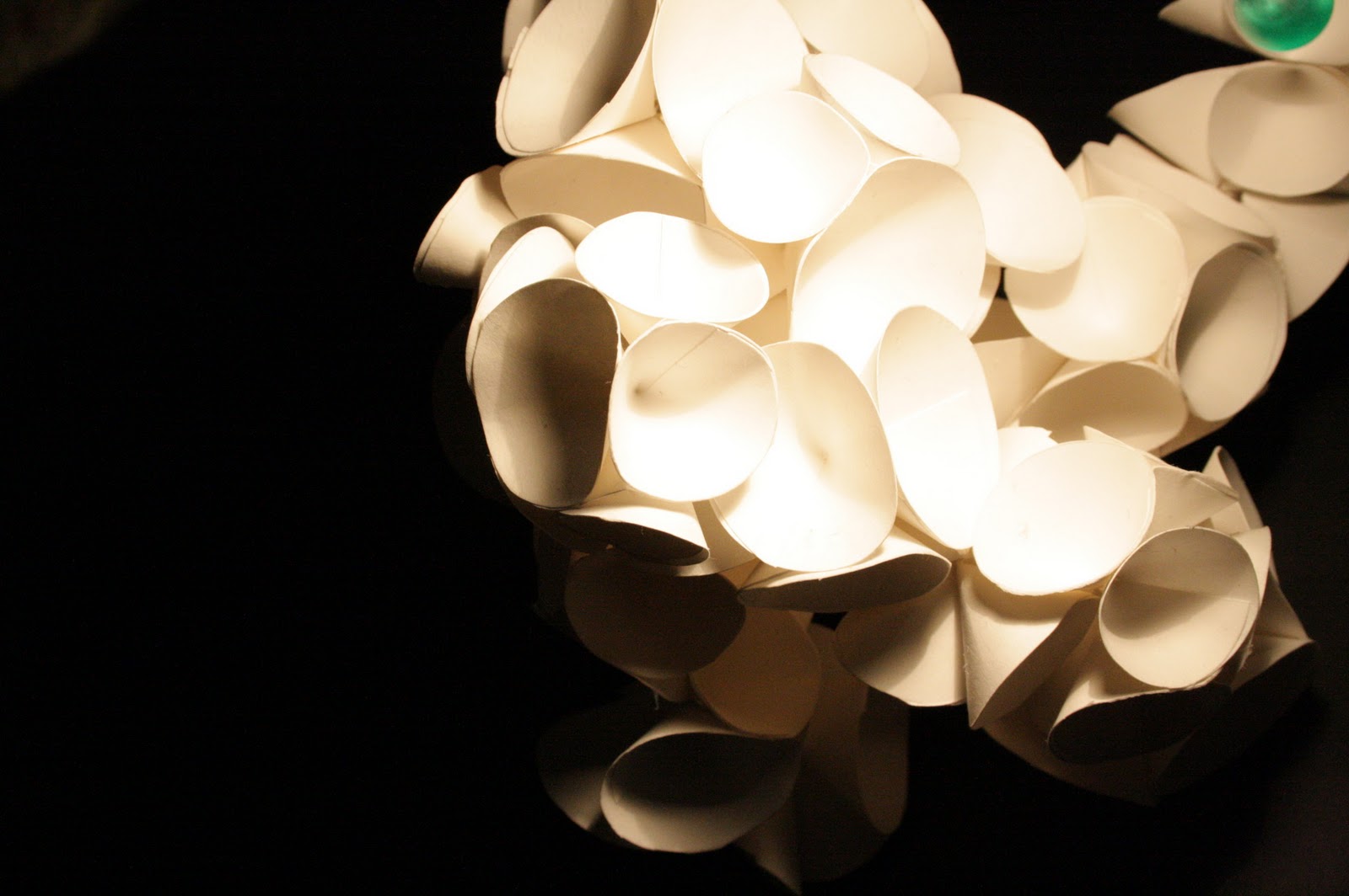
Here are my photos I have taken using a Nikon D60 and using a proper lighting set up...

Above I have used a white backdrop which I think is really effective and creates a modern and contemporary feel to the structure.

Below I have used a black background, which with the lighting creates a moody and sultry effect to the structure. However, I want to have my final piece on the white background as I think it shows off its qualities a lot better than the black background.


Below you can see the final photograph of the tentacle inspired structure. I like the space at the top of the  photo, it allows the piece to breathe within the space.